Marketers need to do to ensure that their mobile sites are fully optimized for the user’s experience if they want to be on the top.

As the Desktop computers loosing popularity and shifting of traffic on mobile the Mobile SEO has gained significant importance. According to the latest surveys it is presumed that about 1/3rd world’s population (about 2.6 billions) will be using smart mobiles in the very near future. This rising trend of using smart mobiles is going to have a great impact on the consumer’s behaviour worldwide. The search behaviour, asking questions, looking for the reviews of the products they want to buy, searching stores nearby to where they are located and purchasing products online are all going to be made through using smart phones. Looking at all these developments the mobiles SEO has assumed added importance and best SEO practices should be considered right way if we want to be right on the top. This is very important for ecommerce website development.
With latest smart phones in hand everybody is managing his life through it. One browse website for every small query, and if there is delay in website loading he bounce it and shift to other website. As page load increases so is the increase in bounce rate. A study by Google recently shows that if a web page takes longer than 3 seconds to load, on an average there is 53% bounce rate is there.
Therefore marketers need to do to ensure that their mobile sites are fully optimised for the users experience if they want to be on the top and reap rich benefits for their business.
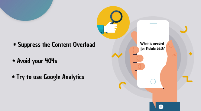
What is needed for Mobile SEO?
A responsive website is very necessary, otherwise as per the survey about 40% people will stop engaging the website and treat it as unattractive. It is seen that 91% of small businesses and start-ups don’t have a responsive mobile optimized website. Though most of the websites have started adding mobile browsing aspect in their websites but generally they ignore the responsiveness factor in their websites and website development agency should look into this fact.
There should be built in capabilities for your site to detect different screen sizes and adjust to the layout accordingly. Best Mobile websites are the responsive websites that do away with maintain the same website on multiple URLs. There should be only one address of your website regardless of the device through which it is being accessed like smart phone, tablet and big monitors; the important point is the layout of website which will provide best results.
There are few advantages of responsiveness of website, that there will be no loss of users because of slow website redirects and also that Google loves this. But care must be taken that there is no blocking crawlers from reading your CSS and JAWA script files.
Suppress the Content Overload
Refrain from overloading the contents on website. Mobile SEO does not work well with content overload. Then the question arises how to design website for mobile devices? The best and the golden rule of digital marketing are to optimize the user’s experience. Thus it is of no use to load heavy media files and ads to enhance users experience as it keeps the users away from it. For example most of the mobile browsers don’t support Flash Videos and knowingly or due to ignorance you still go ahead and embed a Flash video that the mobile users cannot access then this will be of no use and the effort going in it turns futile and will have bad effect.
Avoid your 404s
Whenever a user browses your site from unrecognized device and they still get sent to your 404 page then what can be said about it. You cannot explain your users why the error is occurring. There should be effort on your part to reduce the exit rate by minimizing 404 redirects, but just create a page for users to get benefits from it. Your 404 should help users what they are looking for.
Try to use Google Analytics
There is a lot of giggle data coming in, and which can easily turn into a bunch of garbled statistic. You should know how to handle it. Since every one cannot analyse the data without some good software tools, Google has come to help the commoners by providing Google Analytics. You can get fair amount of idea about website by using it on your website. You will be able to know the consistency of traffic volumes between your desktop and mobile sites. There is one word of caution that the conversion rate at present time through smart mobile phones will be lesser in number that the desktop numbers.
Though this is not the end of this blog as more new things will arise in future and this trend will further change in times to come and the same will be evaluated in future.


